The Royal Institute of British Architects has just announced its Stirling Award winner from its shortlist of six finalists, and from the ashes of a 2010 disaster has emerged a triumphant and most popular winner. Check out who won as well as the other entries here…
The Stirling Prize is awarded for buildings in the UK which have made the greatest contribution to the evolution of architecture over the past year, and this year’s winner was a runaway favourite with the bookmakers.
Hastings Pier
Hastings Pier can chart its history from 1872. For many years it was a popular pleasure pier famous for musical acts, but its recent past has been much more precarious. Neglected for years, it finally closed in 2008 following storm damage, and in 2010 the end looked neigh, as it faced destruction when a fire ravaged the entire structure.
Residents and friends were determined to use the fire as an opportunity to reimagine the pier. Buoyed by the help of the Heritage Lottery Fund, a RIBA Competition was held attracting entries from around the world.
London-based architects dRMM won the competition and immediately set about meeting with locals and stakeholders to help shape the future of the pier; a future radically different from that of its Victorian inception.
The firm proposed a sustainable pier capable of serving a wide variety of scenarios. Additional fundraising from a local action group found 3,000 shareholders who bought a stake in the project at £100 a share.
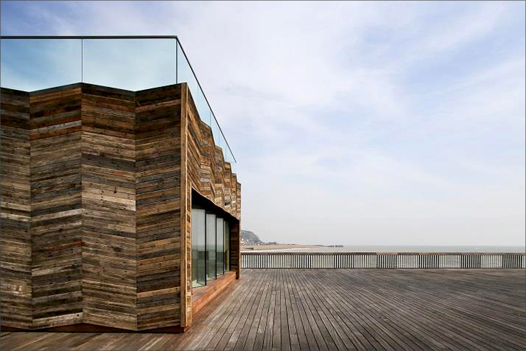
The decision not to place any building at the end of the pier, which is possibly the obvious position to site a building, is an extremely powerful move. The large open space provides a sense of calmness and delight, with a strong connection to the sea and the seafront. The experience of free space and ‘walking on water’ is heightened by the optics of a very beautiful, louvred balustrade design and quality timber deck.
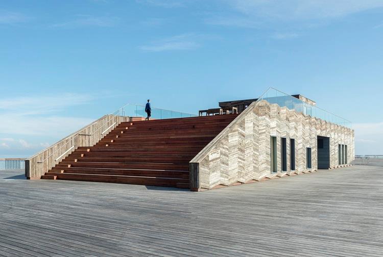
The new visitor centre replacing the weakest section of the damaged pier is a relatively simple CLT structure clad in reclaimed timber which was salvaged from the original fire-damaged pier. This helps to create a strong feeling of place and belonging. It boosts an elevated, rooftop belvedere where locals go for a coffee or cup of soup. It offers adaptable space for events, exhibitions and education. Reclaimed timber deck furniture was designed by dRMM and Hastings & Bexhill Wood Recycling as part of a local employment initiative.
The new pier is not a lonely pier: rather, it is extremely welcoming in its design, with free, open entry to the public. It offers flexibility, material and functional sustainability, and an uninterrupted vista of the natural and built surroundings.
With judging based judged against a range of criteria including design vision; innovation and originality; capacity to stimulate, engage and delight occupants and visitors; accessibility and sustainability; how fit the building is for its purpose and the level of client satisfaction there was only going to be one winner.
That is not to diminish the achievement of the other shortlisted entries, which were as follows…
City Of Glasgow College – City Campus
For our friends up near the Glasgow stores you can check out this one.
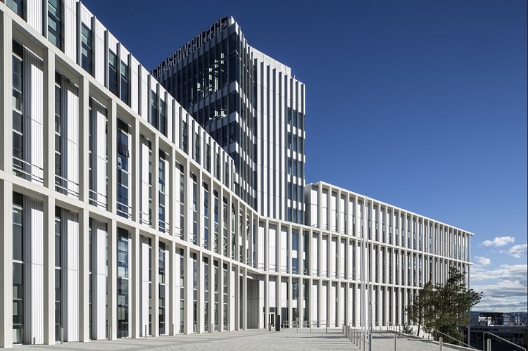
The merger of Glasgow’s central, metropolitan and nautical colleges created a super college bringing together facilities and teaching previously housed in 11 separate buildings across the city within two new central campuses. City Campus, more than 60,000m2 in size, is the second of these large new buildings. It brings together six major faculties in 300 high-tech classrooms, multi-purpose lecture theatres and specialist teaching facilities.
While the initial impression of this building is as something of immense scale which also signals its presence as an important place of learning, its internal spaces are designed to encourage both the formal teaching processes which it contains and informal, more chance encounters. The materials palette and form of the building are deliberately restrained to generate something of skill, clarity and elegance, on the grandest scale.
There is an astonishing scale and complexity to the brief for this project and considerable architectural skill is demonstrated in its realisation; not just in resolving the brief, but in the contribution to the city – in massing, composition and the generosity of the public route through the grand stepped atrium space. This architectural skill extends beyond the cityscape through to the detailed care taken in the organisation of student spaces, encouraging social interaction across disciplines, to the considered approach to materials and detailing.
Barretts Grove
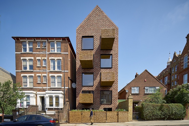
Barretts Grove is a characterful building in a disjointed urban street. Its adjacency to a primary school is a fitting location for a house built with the fairy-tale materials of brick, wood and straw. Inside, the building holds a series of generously proportioned, well-lit apartments; each with a wicker basket balcony that sticks out proud and far, like a salute to passers-by.
The staggered hit-and-miss brick skin of the façade makes a larger-than-usual pattern, which fits the tallness of the overall building. Wrapping the skin up and over the roof, emphasizes the simplicity of the building’s form.
Inside, the feeling is of a large house split into many homes; a refreshing change from the cheap finishes and convoluted corridors of many apartment blocks.
The apartments are double aspect and each room is a good proportion. Space is used wisely and left over space is exploited, for example a strip of workspace overlooks the living room in the top maisonette making a small strip of space a delight to inhabit.
The British Museum World Conservation and Exhibitions Centre
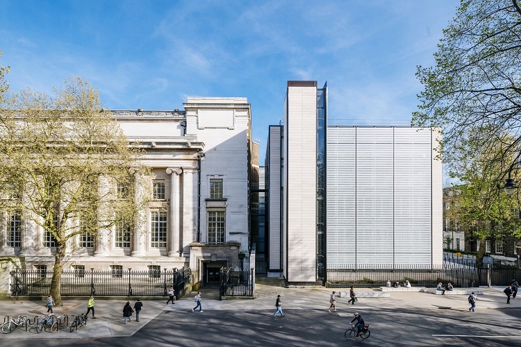
The WCEC building is located on the north-west corner of the British Museum site in Bloomsbury. It consists of five vertically linked pavilions (one of which is located entirely underground), and houses a new exhibition gallery, laboratories and conservation studios, storage, and facilities to support the Museum’ logistical requirements and loans programme.
This building is the realisation of an extremely complicated brief in terms of spatial challenges, technical requirements, and engineering technologies. Its achievement derives from the elegant and simple way these challenges are met, while maintaining a clear and coherent diagram and a refined and rational building enclosure.
The spaces provided for exhibition allow objects of a size and height which would not be possible to exhibit elsewhere in the museum. Objects can be delivered at street level in lorries which are then taken to lower floors by a platform lift which sinks into the ground without disturbing the landscape.
Grander public spaces are accommodated in the main museum, while the new extension provides simple circulation through glass lifts, bridges and glazed lobbies, making the journey through the building clean and enjoyable.
A system of fritted glazed horizontal panels allow controlled light into the building while insuring protection for the exhibits either on display or within the workshops. This allows curation of precious artefacts to occur in an environment that maintains access to natural light.
Command Of The Oceans
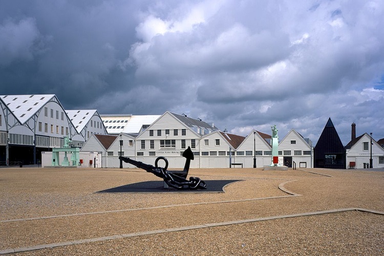
This project is a champion for progressive conservation, inventive re-use and adaptation of existing fabric. The importance of the historic fabric has been clearly understood, which has allowed freedom in other areas to change the circulation and the reading of the buildings to give the whole complex of buildings a new lease of life.
The striking new visitor entrance, clad in black zinc, knits together the historic fabric to either side. The decision to use black cladding rather than a white structure which would match existing, and the decision not to mimic the pitch of the existing roofs, was a bold move in conservation terms and very successful. The modest entrance is immediately obvious to the visitor on arrival in the large car park, which sits above the old mast pond; and yet in certain lights it seems to disappear and becomes very much subservient to the adjacent listed structures. This inventive solution to create a raised entrance with associated ramp won Baynes and Mitchell the architectural competition, and unlocks the whole plan.
The cathedral-like quality of the entrance hall, with its focus on the end view over the dockyard, is very successful. The museum element of the scheme which tells the history of the dockyard is designed around a route which ultimately leads to the hidden timbers of the unknown ship beneath the floorboards. This sense of discovery and the decision to leave the timbers in situ is a very powerful move.
The project is academically rigorous in terms of repairs, reversibility and selection of new materials and is a delightful new addition to the historic dockyard. The project exhibits careful and critical use of appropriate repairs. Successful engagement with specialist craftsmen and sensitive repairs, such as the scarfing of the main timbers in the mast house, adds to the beauty of the refurbished spaces.
Internally, the existing buildings were assessed in terms of their significance and this informed the hierarchy and extent of the new interventions. Baynes and Mitchell have also fully engaged with the impact of the proposals in terms of the archaeology of the site and an appropriate means of responding to the concept of 'as found' presentation.
The palette of black metal, blue limestone, board-marked concrete and composite timber has been carefully chosen in response to the strong, industrial language of the historic buildings and landscape.
This project has benefited greatly from an enlightened client who is committed to making the story of the dockyard accessible to the visitor. This deep understanding of the historical significance of this group of buildings has been fully understood by the architect and interpreted in a way to reveal significant features of the historic landscape. This is a Heritage Lottery Funded project and Historic England was closely involved in a very collaborative way.
Photography Studio
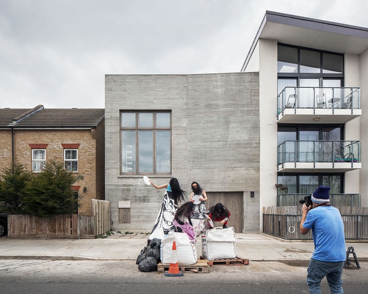
The project comprises a series of three buildings and gardens to form a new studio, offices and archive for celebrated photographer Juergen Teller. The brief was for a light-filled, flexible, informal and welcoming set of spaces; with a natural flow and sociability.
The project expertly exploits a typically London condition. Constrained by a long and narrow industrial plot at the rougher edge of Ladbroke Grove; its only face nestles between cheap developer housing, an industrial estate and the hinterland of the Westway.
With few views possible out of the linear site, daylight is introduced through three courtyard gardens designed by Dan Pearson, and a grid of exquisitely thin concrete beams which march the length of the 60m site. These support north facing roof lights which fill the space with an extraordinary filtered light.
Board-marked poured concrete registers the rhythm of the existing brick built party walls. Two raked concrete stairs brace the studio space, the only interruptions in an open landscape, which runs the length of the site.
Detailing throughout is exquisite; from the in-situ concrete of the finely formed stairs, to the seamless brass balustrades. Large but delicately beaded timber window frames, add refinement to an otherwise minimal material palette. The building is an exemplar of fabric first and low energy design. The integration of services is expertly handled.
The project is a mature and confident statement of orderliness and precision, whilst also being relaxed and playful. It forms a refined, yet flexible workplace, which is already beginning to act as a setting to prompt and influence on the work of its client.